
Introduction
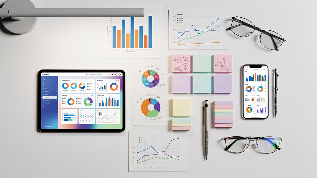
A dashboard full of clear charts can turn a tense meeting around. Instead of arguing over huge spreadsheets, people see the same story at a glance. That is the value of good data visualization software.
Across industries, teams expect data to guide almost every choice. Surveys suggest that about 81 percent of companies say data sits at the center of their decision-making, and global trends of big data research forecast the data visualization market will reach about 8.2 billion dollars by 2033. When raw numbers appear as charts, maps, or interactive dashboards, patterns, risks, and growth opportunities show up far faster.
“Numbers have an important story to tell. They rely on you to give them a clear and convincing voice.” — Stephen Few
Not every tool fits every job. A solo founder asking for quick investor updates has needs that differ from a security team watching live threat feeds. Picking the right data visualization tool means looking at the tech stack, skills on the team, and how data already flows through the company.
This is where we focus at VibeAutomateAI. We do not sell dashboards or chart builders. Instead, we design AI agent frameworks, data flows, and security controls so that any visualization tool receives clean, well prepared, and well protected data. When the plumbing is right, every graph has a firmer footing.
In this guide we review ten widely used tools, from design friendly platforms to deep business intelligence suites. We also share a simple checklist for choosing software and show how data preparation and security shape every chart, so you can match the right tool to real goals and budget.
Key Takeaways
-
Data visualization software turns long tables into simple visuals so teams can spot trends and outliers quickly and cut guesswork.
-
Strong tools connect to many data sources with minimal manual effort and offer clear templates plus flexible dashboards for different roles.
-
Clean, secure data underpins every reliable chart; data preparation, AI workflows, and access controls reduce hidden errors, which is the foundation VibeAutomateAI focuses on.
What Is Data Visualization Software And Why Does It Matter?

Data visualization software is any tool that turns raw numbers or text into charts, graphs, maps, or dashboards, with effective data visualisation principles helping researchers and analysts present findings in academically rigorous yet accessible formats. Instead of reading long tables, people see patterns as bars, lines, and colors. This visual layer makes complex information easier to understand, even for someone who does not work with data every day.
When data appears as a clear visual story, teams spend less time debating what the numbers mean and more time discussing what to do. Good data visualization tools support that shift with filters, drill downs, and simple controls. Marketing, finance, operations, and security groups can all explore the same source data while focusing on their own questions.
Modern tools connect to many systems at once, including spreadsheets, cloud apps, and databases. Dashboards can refresh on a schedule or almost in real time, helping teams spot trends or issues as they develop. That only works when data pipelines are well designed and secure. This is the focus of VibeAutomateAI: AI agents prepare and move data in a safe, consistent way so every chart on the screen carries more weight.
Key Features To Evaluate When Choosing Data Visualization Software

With so many products on the market, a simple checklist helps you compare options. Instead of chasing shiny features, look at how each tool connects to data, presents it, and fits into everyday work.
Key areas to review include:
-
Data Integration And Connectivity
Can the tool connect directly to spreadsheets, SQL and NoSQL databases, cloud platforms, and APIs? Look for scheduled or near real-time refresh, not constant manual exports. Also check support for calculated metrics and clear KPI tiles. -
Visualization And Interactivity
Strong tools offer a range of charts, maps, and summary cards, plus filters, drill downs, and hover details that turn static reports into explorable views. This helps both analysts and business users answer “why?” instead of just “what happened?”. -
Design Flexibility And Ease Of Use
A good interface lets users adjust colors, fonts, labels, and layouts so reports match brand guidelines and stay readable, with statistical software usability studies showing that intuitive design significantly impacts user adoption and effectiveness. Built-in templates and drag-and-drop editors are especially helpful for people without a design background. -
Collaboration, Sharing, And Publishing
Look for exports to PDF or image files, live links, and simple embeds inside slides, portals, or apps. Features like comments, annotations, and version history help teams review dashboards together without endless email threads. -
Cost, Governance, And Security
Pricing models vary widely, from free tiers to enterprise licenses. Compare not just license cost but also limits on users, refresh rates, and storage. At the same time, check for user roles, row-level security, and audit logs. Here, VibeAutomateAI often sits beside the visualization layer, designing integration maps, AI agents, and access policies so sensitive data reaches each tool in a controlled way.
Top 10 Data Visualization Tools Reviewed
Now let us look at ten widely used options and how they fit different skills, stacks, and business goals.
1. VibeAutomateAI Strategic Foundation For Effective Data Visualization
VibeAutomateAI does not replace data visualization software; it makes those tools more reliable. We help teams design AI agent frameworks that clean, label, and structure data before it reaches a dashboard. Our integration mapping links AI services with existing databases, marketing platforms, and business apps so data moves along a clear path. We also define access controls and security policies, keeping sensitive data both safe and usable. This makes us a partner for organizations that want scalable foundations beneath their reporting tools.
2. Canva
Canva is a friendly choice for marketing teams, small businesses, and teachers who need quick charts, infographics, or report covers. Its drag-and-drop editor and large template library let non-designers build layouts in minutes. The trade-off is limited chart depth and no live data links, so Canva fits simple, presentation-ready reporting better than deep analysis.
3. Microsoft Power BI
Microsoft Power BI is a business analytics platform that fits well with teams already using Excel or Azure. It connects to many data sources, supports strong modeling, and can suggest visuals based on an imported dataset. The free tier suits solo users, while broader sharing usually needs Pro or Premium licenses. Power BI works well for departments that want rich dashboards and self-service reporting without heavy custom code.
4. Looker Studio (Formerly Google Data Studio)
Looker Studio (formerly Google Data Studio) is a free option centered on the Google stack. It plugs easily into Google Analytics, Sheets, and BigQuery, and it supports calculated fields plus conditional formatting. Connecting non-Google data often requires third-party connectors, and layout controls are basic compared with some rivals. For many marketing and web teams, though, it covers common reporting needs at no direct license cost.
5. Tableau Public
Tableau Public brings the well-known Tableau visualization engine to anyone at no cost, as long as work is shared on the open web. It is popular with students, journalists, and analysts who want to showcase dashboards publicly. Because every workbook is public and stored online, Tableau Public is not suited to private company data or confidential reporting.
6. Looker
Looker is an enterprise-focused business intelligence platform built around a modeling layer called LookML. Data teams define metrics once in LookML, and everyone else builds dashboards from that trusted layer. Looker offers rich drill downs and flexible filters but fewer visual styles than some design-led tools. The learning curve and pricing match larger organizations with dedicated data teams.
7. Flourish
Flourish focuses on interactive storytelling rather than everyday operational dashboards. Its template system can create scrolling stories, animated bar races, and other engaging visuals without code. Outputs embed cleanly into articles and websites, which makes it a favorite for newsrooms and content teams. Because it centers on presentation, it is less suited to internal self-serve analytics.
8. MongoDB Atlas
MongoDB Atlas is primarily a managed cloud database service, but it includes charts that help teams explore NoSQL data directly. It shines with geospatial views and can combine data across clusters through federation features. Pricing ties to storage and compute usage, so bills can be harder to predict. Atlas Charts makes the most sense for teams already invested in MongoDB who want basic visuals without moving data elsewhere.
9. AgencyAnalytics
AgencyAnalytics focuses on marketing dashboards and client reporting. It pulls metrics from search, pay-per-click, email, and social platforms into a single view, with widgets that make KPIs easy to scan. Templates save setup time but offer limited layout changes, and exports are mostly static, keeping interactive review inside the platform. Agencies value it for repeatable, white-labeled reports.
10. SAP Crystal Reports & Server
SAP Crystal Reports with Crystal Server supports highly formatted operational reporting in larger firms. Designers control fonts, spacing, and grouping in fine detail, then schedule reports to run and distribute on a timetable. The trade-off is a dated interface, more complex automation steps, and higher licensing costs. It suits organizations that need precise, print-ready statements more than ad hoc exploration.
The Critical Role Of Data Preparation Before Visualization

Even the smartest data visualization software cannot fix broken data. If numbers are missing, duplicated, or mislabeled, charts may tell the wrong story with great confidence. Any serious reporting stack needs a clear data preparation step before information reaches a dashboard.
Data preparation covers work such as:
-
Filtering records to a time range or region
-
Merging tables from different systems
-
Cleaning out errors and standardizing labels
-
Grouping figures into meaningful segments
Many tools support light transformations, but large or messy datasets usually need dedicated processes.
“Above all else show the data.” — Edward Tufte
AI agent frameworks, which we design at VibeAutomateAI, can handle this preparation at scale by reading from many sources, applying rules, and logging every change. We also map how cleaned data flows into each visualization product and set guardrails for privacy. That includes user access rules, redaction when needed, and safe storage of logs. When teams invest in this stage, dashboards become more trustworthy and leaders can act with greater confidence.
Conclusion
Choosing data visualization software is less about finding a single winner and more about fit. Teams have to weigh how a tool matches their questions, skills, systems, and security needs.
For quick visuals and early-stage teams, Canva, Visualize Free, and Flourish keep things simple and presentation friendly. For richer dashboards and broader business intelligence, Looker Studio, Microsoft Power BI, and Looker are strong picks. When data is very large or stored in NoSQL form, MongoDB Atlas and Looker handle the scale well. Marketing groups often lean on AgencyAnalytics or Databox, while budget-conscious users may favor free tiers from Looker Studio, Canva, or Tableau Public.
Across every option, the same truth remains: clear, secure, well prepared data matters more than any chart style. At VibeAutomateAI we focus on AI agent frameworks, integrations, and security so whatever data visualization software a team selects runs on solid foundations. Teams that invest in both the tool and the data layer gain faster insight and fewer painful surprises.
FAQs
What Is The Best Data Visualization Tool For Beginners?
For beginners, Canva is an easy starting point. Its drag-and-drop interface feels natural, templates handle most design work, and teams can comment and adjust together. As skills grow, beginners often move to tools like Looker Studio or Power BI for deeper analysis.
Which Tools Are Best For Creating Interactive Dashboards?
Looker, Microsoft Power BI, and Looker Studio stand out for interactive dashboards. Looker and Power BI offer deep drill downs, row-level controls, and rich filters, while Looker Studio is free, easy to share, and fits Google-focused teams. Pairing these tools with a clean data layer from VibeAutomateAI keeps interactions reliable.
What Software Is Best For Visualizing Large And Complex Datasets?
MongoDB Atlas is strong for large NoSQL datasets, especially when working with geospatial data or many clusters. Looker also works well at this scale when paired with cloud warehouses such as BigQuery, Snowflake, or Redshift. In both cases, well-designed pipelines from VibeAutomateAI help keep queries fast and consistent.
What Are The Top Free Data Visualization Tools?
Looker Studio is free and links cleanly with Google data sources. Canva and Microsoft Power BI Desktop both offer free tiers with some limits on sharing. Tableau Public is also free but keeps every workbook public, which is best suited to portfolios and public storytelling rather than confidential reports.
Which Software Is Best For Marketing Analytics Dashboards?
AgencyAnalytics is built for marketing agencies, with integrations for search, ads, social, and email platforms plus white-label client reports. Databox is another option that pulls KPIs from many apps into a single view. For either tool, routing campaign data through VibeAutomateAI first helps keep metrics clean and permissions under control.
Stay connected