Introduction
Every team knows the pain of a last‑minute image request. A sales deck needs cleaner screenshots, a marketing campaign needs fresh product photos, or security wants sensitive details blurred before a report goes out. Paying for another subscription or waiting on a busy design team is not always an option. That is where a focused GIMP tutorial starts to pay off.
GIMP is a free, open‑source alternative to Photoshop that can deliver genuinely professional results. The problem is that many people open it once, see all the panels and menus, and close it again. It looks dense, and nobody has time for a full design degree. We wrote this GIMP tutorial to cut through that feeling and show a fast, business‑ready workflow.
In the next 30 minutes, we walk through a clear path from opening your first image to exporting a polished file ready for web, print, or internal reports. We stay focused on the 20 percent of features that cover 80 percent of real work. Along the way we connect these skills to modern, AI‑supported workflows that teams build with VibeAutomateAI, so individual edits fit neatly into secure, automated pipelines rather than sitting on one person’s laptop.
Key Takeaways
- Practical image handling: You learn how to resize, crop, rotate, and export images in GIMP with confidence, which covers most daily needs for web, email, and presentations while keeping quality high.
- Clean, professional photos: You get simple steps for exposure, color, and contrast fixes that make photos look polished instead of amateur, even when they come from phones or quick screenshots.
- Non‑destructive editing: You understand layers and masks so you can work in a reversible way, which makes revisions easy when a manager or client changes their mind late in the process.
- Repeatable workflow: You follow a repeatable 10‑step workflow plus export best practices and shortcuts, so GIMP stops feeling random and starts to feel like a reliable part of your business toolkit.
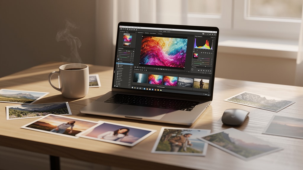
Understanding The GIMP Interface And Workspace
Before you adjust anything, you need a mental map of the screen. GIMP can run in a multi‑window layout or in Single‑Window Mode. For beginners, it helps to turn on Single‑Window Mode under the Windows menu so everything stays inside one frame.
By default, you’ll see:
- Toolbox (left): Core tools such as Move, Crop, Select, and Brush.
- Canvas (center): The main image area where your photo or graphic appears.
- Dockable panels (right): Panels for Layers, Brushes, History, and more.
You can drag these docks to rearrange them, but keeping Layers visible at all times is one of the best habits for professional work.
To open your first image, go to File → Open and pick a file. Look at the title bar of the window. You will see the file name, color mode, number of layers, and pixel dimensions. That simple line tells you how big the image is and gives an early hint about where it will fit, for example a web page header or a slide. As you grow, you can create a custom workspace and save it, with the New Official Snap package making installation and updates more convenient across Linux distributions, but this basic layout is enough for fast, reliable editing.
Essential Image Adjustments: Resize, Crop, And Optimize
Most business requests fall into a few simple tasks. Someone needs an image smaller, tighter, or lighter for a web page or a report. These are the high‑impact actions that a practical GIMP tutorial for beginners must cover first.
Resizing Images For Different Platforms
Resizing controls how many pixels an image has, which matters for email size, web speed, and print clarity. With the image open, go to Image → Scale Image. A dialog appears with Width, Height, and a small chain icon between them.
When the chain looks linked, GIMP keeps the aspect ratio. This means that if you type a new width, the height updates on its own, so faces do not look stretched. You can switch from pixels to percent if you only need something like half‑size for a quick draft. For example:
- A 1200‑pixel‑wide banner can drop to 800 pixels for a blog header.
- The same banner can drop to around 600 pixels for email use.
In the Quality area, pick LoHalo or NoHalo as the interpolation method, especially when scaling down. These options keep edges sharper. Click Scale and the canvas updates.
Remember that scaling changes image dimensions, while file size on disk also depends on compression, which you control at export time.
Cropping For Professional Composition
Cropping changes what you keep in the frame, not the pixel density itself. Pick the Crop Tool in the Toolbox, then click and drag over the area you want. A rectangle appears with handles on the sides and corners.
You can:
- Drag the handles to refine the selection.
- Move the entire rectangle to shift the framing.
- Watch how the subject sits in the frame while you adjust.
Many photos look better when the subject sits near a third of the way from an edge, a simple version of the rule of thirds. When you are happy, press Enter to commit the crop. If you change your mind, press Esc before committing.
For more precise work, use the Rectangle Select Tool first, then choose Image → Crop to Selection. This is ideal for profile images, product cut‑outs, or small graphics for slides.
Optimizing File Size For Web Performance
After resizing and cropping, you still care about how many kilobytes the file uses. Go to File → Export As and type a name that ends in .jpg or .jpeg. In the JPEG export dialog, you will see a Quality slider.
A setting around 80–90 usually keeps the image looking clean while cutting size enough for fast loading. Turn on Show preview in image window and watch both the visual result and the estimated file size.
This small step has real business impact because faster pages help search rankings and reduce bounce rates. Always keep your full‑quality source file separate so you never get locked into a heavily compressed version.
Color Correction And Enhancement Fundamentals
Once size and framing look good, color and tone decide whether an image feels cheap or professional. These adjustments are not about wild effects; they are basic fixes for brightness, contrast, and white balance so photos match reality and brand standards.
“You don’t take a photograph, you make it.” — Ansel Adams
That “making” part is where careful color work counts. In GIMP, the Colors menu holds most of these tools.
We treat these as technical repairs before any creative styling. That approach mirrors how professional retouchers work and makes your edits predictable.
Adjusting Exposure And Brightness
Start with Colors → Exposure. This tool lets you control overall brightness in a clean, controlled way. The main Exposure slider brightens or darkens the mid‑tones, which is where most detail lives.
Below that, the Black Level slider sets the point where dark areas become true black. Moving it slightly to the right can add snap to a flat image, but too far will crush shadow detail. Treat exposure correction as the first step after import because later tools such as Curves work better once the base level is right.
In newer GIMP builds, you can even run Exposure as a non‑destructive adjustment on a layer, which keeps options open for revision.
Recovering Detail With Shadows‑Highlights
Next, go to Colors → Shadows‑Highlights. This tool focuses on the darkest and brightest zones without changing the middle as much. The Shadows control brightens dark areas so you can see faces or objects that were hidden. The Highlights control brings back detail in bright skies or white shirts.
A common case is a backlit portrait where the person is dark and the sky is blown out. A modest boost to Shadows and a small pull on Highlights can fix this fast. Start with small moves, then compare before and after. This way the image looks natural while still meeting the quality bar that clients expect.
Color Temperature And White Balance
If a photo looks very blue or very yellow, color temperature is off. Office fluorescent lights often make skin look cool and gray, while tungsten bulbs lean toward orange. In GIMP, Colors → Color Temperature gives a simple Warmth slider, which is great for quick fixes.
For finer control, use Colors → Color Balance. This tool lets you adjust shadows, mid‑tones, and highlights separately along three color pairs. For example, you can add a touch of blue only to highlights while keeping shadows neutral.
Look for known neutrals such as white paper or gray walls to guide your eye. Accurate color is important in product photography, brand assets, and security reports where diagrams must match standard colors.
Working With Layers For Non‑Destructive Editing
Layers are where GIMP starts to feel professional instead of like a simple paint program. Think of layers as clear sheets stacked on top of each other. You can change one sheet without touching the rest, then reorder them at any time.
For business work, this matters a lot. A logo watermark, redaction boxes over sensitive data, and text labels should all sit on their own layers so you can edit or remove them later without redoing the whole image.
Understanding Layer Basics
The Layers dialog usually sits on the right. If you do not see it, enable it under Windows → Dockable Dialogs → Layers. Each item in that panel is a separate layer with its own visibility eye icon and thumbnail.
You can:
- Add a new layer with Layer → New Layer.
- Name layers clearly, for example Logo, Blur Mask, or Text Labels.
- Adjust Opacity to control how strongly a layer appears over the layers below.
Drag layers up or down in the list to change which content sits on top. A common example is adding a logo for a social media graphic, as demonstrated in real‑world examples like One of my recent GIMP projects shared by professional users. Place the logo on its own layer, move and scale it into place, and lower the opacity slightly if you want a watermark feel. This approach keeps edits reversible when brand rules or clients change their minds.
Introduction To Layer Masks
Sometimes you do not want to hide a whole layer, only parts of it. Layer masks handle that need. A mask is a grayscale image tied to a layer that tells GIMP where that layer should show or hide.
- White on the mask means the layer is visible in that area.
- Black hides it.
- Gray gives partial transparency.
To add one, right‑click a layer in the Layers panel and choose Add Layer Mask. You can start from the current selection, which is very handy.
For example, you can place a portrait over a background, make an oval selection around the face, then add a mask from that selection. Now the portrait blends with the new background without deleting any pixels. Because you are painting on the mask, not erasing the layer, you can refine edges later when feedback arrives.
Professional Photo Editing Workflow In 10 Steps
Random clicking through menus wastes time and gives inconsistent results. A simple, repeatable workflow keeps your edits fast and predictable, even when different team members handle different images. The steps below are the same pattern we use when training teams who follow this GIMP tutorial.
“Consistent results come from consistent process, not from guessing in front of a screen.” — common advice in design teams
Use this 10‑step workflow as your checklist.
- Import And Initial Assessment
Open the file with File → Open and zoom in to 100 percent. Check exposure, contrast, color cast, noise, and sharpness. Confirm pixel dimensions match the planned use such as web banner or slide. Note what needs help before you touch any sliders. - Correct Exposure
Go to Colors → Exposure and adjust the main Exposure slider until the image no longer looks too dark or washed out. Use the Black Level control to set a clean black point without losing important shadow detail. Watch the histogram if you know how, but trust your eyes first. This step sets the base for every other adjustment. - Adjust Shadows And Highlights
Open Colors → Shadows‑Highlights and start with small moves. Brighten Shadows to reveal important details and lower Highlights to control bright areas like skies or white walls. Aim for a natural look instead of a flat one. Toggle preview on and off to keep perspective. - Fix Color Temperature
Use Colors → Color Temperature when the whole scene feels too cold or too warm. Slide toward warm for bluish office shots or toward cool for very orange scenes. For targeted control, switch to Colors → Color Balance and tweak shadows, mid‑tones, and highlights separately. Compare skin tones or known neutral objects as you go. - Increase Saturation
Open Colors → Hue‑Saturation and raise Saturation slightly to make colors feel more alive. If the image is for a serious report, keep changes subtle so it does not look cartoonish. You can also target one color band at a time, such as boosting only reds in a product label. Less is often better than more. - Add Contrast With Curves
Colors → Curves gives fine control over contrast. Create a gentle S‑shaped curve by pulling a point in the shadows slightly down and a point in the highlights slightly up. This adds depth and pop without extreme clipping. Avoid dragging points too far, which can crush details or burn highlights. - Sharpen For Clarity
Once tones and colors look right, go to Filters → Enhance → Unsharp Mask. Set a small Radius and moderate Amount, then preview at 100 percent zoom. Increase slowly until edges look crisp but not crunchy. Sharpening should be one of the last adjustments before export. - Add Subtle Vignette
Create a new transparent layer above your image. Use the Ellipse Select Tool to draw an oval over the subject and feather the selection with a large value. Invert the selection and fill it with black on the new layer. Drop the opacity until corners look gently darker and attention moves toward the center. - Apply Noise Reduction
Open Filters → Enhance → Noise Reduction when you see grain from high ISO or low light. Start with modest settings and preview at 100 percent. The goal is to smooth blotchy areas without smearing important detail such as eyes or text. Fine‑tune until the balance feels right. - Final Crop And Composition Check
Use the Crop Tool to tighten framing and clean up edges. Apply the rule of thirds or center key elements based on your message. Remove stray objects at the edges that draw the eye away. When the frame supports your goal and dimensions fit the target platform, you are ready to export.
Creating Selections And Shapes For Graphic Design
GIMP is not only for photos. It also works well for basic graphic design work such as social banners, profile photos, and slide elements. Selections are the base for most of these tasks because they define where edits apply and what shapes you keep.
Selection Tools Overview
GIMP gives several ways to define a region:
- Rectangle Select Tool: Ideal for sharp, geometric areas such as screenshots or callout boxes.
- Ellipse Select Tool: Handles circles and ovals; holding Shift keeps the shape perfectly round.
- Free Select Tool: Lets you click around an object or draw a rough outline by hand for irregular shapes.
On the options bar, selection modes let you add to, subtract from, or intersect with existing selections. This means you can build complex shapes by combining several simple ones instead of trying to draw a perfect outline in one pass. Feathering softens edges slightly so blends do not look harsh when you cut or mask parts of a layer.
Creating A Circular Profile Image
Circular profile images look cleaner on many modern sites than plain rectangles. To create one, start by opening your portrait and selecting the Ellipse Select Tool. Hold Shift and drag to draw a circle over the face, then move it until the framing feels right.
If you want a direct cut‑out:
- Add transparency with Layer → Transparency → Add Alpha Channel.
- With the circle still active, go to Select → Invert and press Delete.
Everything outside the circle clears, leaving a clean circular image on a transparent background.
A more flexible method uses a layer mask. With the selection active, right‑click the layer, choose Add Layer Mask, and pick the Selection option. The circle stays visible, the rest hides behind the mask, and you can refine the edge later.
Export as PNG to keep transparency for your website, team directory, social avatars, or conference materials. For large teams, you can repeat this pattern across many photos and standardize the brand look.
Exporting And Saving: Preserving Your Work
One of the easiest ways to lose time is to overwrite your only copy of a file or to export the wrong format. Professional editors think in terms of two types of files. One is a working project that keeps every layer. The other is a flat export for web or print.
Saving GIMP Project Files (XCF)
When you are in the middle of edits, use File → Save or File → Save As. GIMP writes an XCF file, which is its native project format. This file keeps layers, masks, selections, text, and paths, all editable later.
Treat the XCF as the source code of the image. Save after big changes and before risky experiments, just as you would commit code before a major refactor. XCF files are larger than JPEG or PNG because they store so much information, so keep them in organized project folders. That structure matters when teams share work across marketing, security, and design.
Exporting For Web And Print
When you are ready to publish or send a file, use File → Export As. Pick a name and choose a format by changing the extension such as .jpg, .png, or .gif. Exporting flattens all visible layers into a single image that other tools can read.
General guidance:
- JPEG: Best for photos and complex scenes; small files and good quality, but no transparency.
- PNG: Better for logos, icons, and graphics with sharp text or transparent backgrounds.
- GIF: Still useful for small animations and very simple graphics with limited colors.
When exporting JPEG, use the Quality dialog with preview to balance sharpness and size. Online content cares about fast loading, so you can push quality down a bit, while print material benefits from higher quality settings.
Always keep the XCF project as the master and treat exports as disposable copies, even when you automate batch exports for social formats.
Integrating GIMP Into Modern Business Workflows
GIMP gives strong editing power to individuals, but businesses care about systems, not just single images. Real teams deal with repeated tasks such as resizing the same banner for ten platforms, standardizing color for product photos, and scrubbing confidential data from screenshots before they leave secure environments, which raises questions explored in Henner Gimpel’s Post about AI tools and academic integrity in professional workflows.
This is where hybrid workflows shine:
- A person uses GIMP for precise work such as masking, retouching, and composition.
- AI tools handle bulk steps such as first‑pass exposure fixes, background removal, or multi‑size export sets.
Without a plan, though, these tools can become a mess of disconnected apps and manual steps.
VibeAutomateAI helps organizations map their current image flow from capture to publication. The focus is on spots where AI photo editing tools, generators, and export pipelines can remove repetition without hurting control or security. That might mean an automated step that normalizes exposure and size on a folder of product shots before designers fine‑tune them in GIMP.
It also means designing secure content stores, access controls, and review steps so sensitive visuals such as unreleased features or financial data never leak. With the right architecture and light governance, teams move from one‑off edits to a predictable stream of polished, compliant images, where GIMP is a trusted station inside a broader, intelligent system.
Conclusion
In a short time, we have covered the core skills that make GIMP feel like a professional tool instead of a mystery. You can now resize, crop, and optimize images; repair exposure and color; build non‑destructive edits with layers and masks; follow a clear 10‑step workflow; and export files that look sharp and load fast.
These moves already cover a large share of daily needs in marketing, security reporting, and internal communication. Mastery takes practice, but you now have a stable base to build on. The best next step is simple: use this GIMP tutorial on real tasks such as cleaning up slide graphics, preparing profile photos, or polishing screenshots for a compliance report. Then explore filters, brushes, and more advanced selections as your confidence grows.
At an organizational level, individual skills are only part of the story. The deeper question is how to connect human editors and AI tools into one secure, efficient system. That is where VibeAutomateAI comes in. The team designs integrated architectures that combine tools like GIMP with AI automation and strong security, so groups move faster, keep quality steady, and protect sensitive visual assets. If your business is ready to treat visual content as a managed process rather than one‑off hero work, VibeAutomateAI can help you plan the next step.
FAQs
Is GIMP Really As Good As Photoshop For Professional Work?
For most business use cases, GIMP is more than strong enough. It offers deep tools for color correction, layer compositing, retouching, and web graphics. The main gaps appear in very specialized print workflows such as strict CMYK color handling and some advanced filters that certain studios use. For web‑focused teams and internal reports, GIMP handles well over ninety percent of tasks without license fees, and the open‑source nature gives long‑term flexibility.
Can I Use GIMP On Mac And Windows?
Yes, GIMP runs on Windows, macOS, and Linux. The interface looks slightly different on each system, but the tools and menus are the same, so skills transfer cleanly. Older macOS versions may need extra components during install, yet once running, the editing experience matches what you learn in this GIMP tutorial.
How Long Does It Really Take To Become Proficient?
Basic competence comes faster than most people expect. With a few hours of focused practice on real work, the resize, crop, color, and export steps start to feel natural. Deeper mastery, such as complex masking and advanced retouching, takes months of steady use. Running the 10‑step workflow from this tutorial on several projects until it feels automatic is a strong way to build muscle memory. A small set of skills covers most needs, so you see good returns early.
What File Formats Should I Use For Different Purposes?
For photographs on web pages, social platforms, and email, JPEG is usually the right pick because it keeps files small with acceptable quality and does not need transparency. PNG works better for logos, charts, and graphics with sharp text or clear backgrounds, since it is lossless and supports transparency. GIF is still useful for small animations and very simple graphics with limited colors. XCF is for working files only, so keep it as your master copy. Most business work lives online, and a mix of JPEG and PNG handles nearly all of those needs.
Can GIMP Handle RAW Photo Files From Professional Cameras?
GIMP can work with RAW files through external tools or plugins. A common practice is to open RAW images in programs like RawTherapee or Darktable, make base adjustments there, then send the result into GIMP for detailed editing and layout. Many organizations rely on smartphone images or stock photos in JPEG or PNG form, so RAW handling is nice to have rather than a daily requirement for most teams.
How Does GIMP Compare To AI‑Powered Photo Editors?
AI‑driven editors are great at quick global fixes such as auto lighting, background cleanup, and batch processing. GIMP shines when you need precise, manual control, careful masking, and fine‑tuned brand alignment. The strongest approach blends both: AI tools handle the first pass and bulk resizing, while editors refine key assets in GIMP.
VibeAutomateAI helps design that kind of hybrid setup, where AI does the repetitive work and humans handle judgment‑heavy tasks, all within a secure and well‑governed content flow. This balance keeps quality high while reducing the time your team spends on routine image work.
Stay connected